Crashes Without a Cause: Markets as Phase Transitions

On October 19, 1987, the S&P 500 lost more than 20 percent.
The size of the fall was only part of the strangeness. The usual story never arrived. No bank failed that morning. No war started. No earnings report, rate decision, or political announcement came close to explaining a one-day move of that size. People searched for the cause because markets are supposed to need causes. Black Monday mostly refused to provide one.
Bouchaud and his collaborators later found the same problem at a smaller scale. Look at large jumps in individual stocks and the matching headline is often missing. The move is real; the news is too small, or absent.
That leaves an uncomfortable possibility: sometimes prices move because the market has already begun to move.
The model that makes this feel less mysterious was not built for finance. It was built for magnets. Before turning it into a market, we need to build the magnet first.
#I. A grid of people who copy their neighbors
Picture a giant checkerboard. In every square sits one person. Each person holds a simple opinion, yes or no, and you can think of it as a color: red for yes, blue for no. That is the whole cast. The board is the famous Ising model, invented in the 1920s to study magnets, where each square was an atom and the opinion was which way the atom pointed.
Two forces act on each person.
The first is copying. Everyone looks at their four neighbors, up, down, left, right, and feels a pull to match them. If the people around you are red, you lean red. This is peer pressure, and nothing more.
The second is noise. People are not robots. Now and then someone flips for their own private reasons, ignoring the neighbors entirely. We bundle all of that stubborn independence into one number and call it the temperature. Hot means lots of random flipping. Cold means people mostly do what their neighbors do.
These two forces pull in opposite directions. Copying drags each person toward their neighbors; temperature scatters them back toward acting on their own. Neither number decides anything by itself, only the balance between them does, and turning copying up has the same effect as cooling the temperature down. So the board really has one knob: how strong the copying is next to the temperature. Turn that knob and watch what the whole board does. There are three things it can do, and the picture below shows all three.
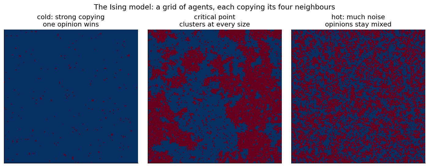
The same board of neighbor-copying people at three settings. Cold on the left, the critical point in the middle, hot on the right.
Cold board, on the left. Copying wins. Almost everyone agrees. One color floods the whole board, with only a few lonely holdouts. The crowd has locked into a single opinion, and it took no leader and no announcement to make that happen. Local copying did it on its own.
Hot board, on the right. Noise wins. Everyone is flipping so much that no agreement can form. The board is a fine static of red and blue, like television snow. Ask “what does the crowd think?” and the honest answer is nothing in particular.
The middle board. This is the interesting one, and it sits at one exact setting of the knob that physicists call the critical point. Here copying and noise are perfectly balanced, and you get neither flood nor static. Instead you get blobs of agreement at every size. Small patches, medium patches, and a few enormous ones, all at once. This is the setting where the board is most alive and most twitchy, and it is where everything interesting happens.
Better yet, run the board yourself. Drag the temperature down toward a cold, agreeing crowd, up into hot static, and hold it near the critical edge to watch blobs of every size form and break apart. Nudge the news and the whole crowd leans one way.
#II. Why the middle setting is special
Forget magnets for a second and think about water. Cool it and nothing dramatic happens for a long time. Then around zero degrees it does something violent and sudden: it turns to ice. A tiny change in temperature can flip the substance into a completely different state. That kind of regime change is called a phase transition. Freezing is the abrupt kind, where the substance snaps cleanly from one state to the other. The critical point is the rarer, knife-edge case, where the system is poised exactly between two states instead of snapping between them.
The Ising board has the same kind of moment. Turn the knob slowly through the critical point and the board stops behaving like a noisy scatter of independent opinions and starts behaving like one collective object. In the ideal infinite model, the shared mood turns on continuously; in a real finite board, the visible change can look abrupt because the whole board has to choose a side. The middle picture above is the board caught at the edge where that choice is most unstable.
Right at that edge, two odd things become true, and both will matter once we get to markets.
First, a tiny push can move the whole crowd. Away from the critical point, nudging one person barely matters, because their neighbors hold them in place. At the edge the board is balanced so finely that one flip can flip a neighbor, then another, and the change races across the whole board. Small cause, huge effect.
Second, big swings need no big trigger. Those large blobs in the middle picture form and break apart on their own, purely from people copying each other. Nothing outside ordered them. The board generates its own large moves.
Those two facts are the whole reason any of this matters for money.
For readers who like an equation, the whole model fits on one line. Let $m$ be the crowd’s overall mood, running from $-1$ (everyone blue) through $0$ (an even split) to $+1$ (everyone red). Let $J$ be how strongly people copy their neighbors, $h$ an outside push toward one color, and $T$ the temperature, the amount of random independent flipping, with $\beta = 1/T$.
Now follow one person. The pull they feel is the copying strength times the crowd’s current mood, plus the outside push: $Jm + h$. They turn that pull into their own leaning through an S-shaped curve called $\tanh$, which has one job: it takes any pull, however large, and squashes it into an answer between $-1$ and $+1$. Nobody can lean more than all the way. Average that response over everyone and you get the mood the crowd produces.
Here is the twist. The mood people react to is the same mood they create. So the only states that can last are the ones that feed back into themselves:
$$ m = \tanh!\big(\beta (J m + h)\big). $$
You do not solve this by plugging in numbers, because $m$ sits on both sides. You look for a mood that, passed back through everyone’s copying, returns itself. Physicists call that a fixed point.
How many fixed points exist is the whole story, and it turns on one combination, $\beta J$, which is just copying strength divided by temperature, the same balance from before. When copying is weak next to the noise ($\beta J < 1$) there is a single fixed point, and it follows the news $h$ smoothly. When copying is strong ($\beta J > 1$) the same equation has three: two stable crowds, mostly-red and mostly-blue, and an unstable balance point between them. That split is the fold, and it is where crashes and melt-ups come from. The grid pictures keep the literal neighbor-by-neighbor story; this average-crowd shortcut is what lets the next figures draw those folds on one page. The simulation above has these exact controls, temperature $T$, copying $J$, and news $h$, and it shows $J/T$ live, so you can push $\beta J$ past one yourself and watch the single mood split in two. If equations are not your thing, skip it. The pictures carry the argument.
#III. Why a magnet model fits markets so well
Now the harder question: why should a toy built for atoms say anything about the stock market? The connection is concrete. The model has become a real tool in quantitative finance, and there are a few solid reasons for that.
Start with the obvious one. A magnet is many simple parts pulling on each other, and so is a market: millions of traders, each watching the price and each other. Swap the four neighbors for everyone you can see and the copying force turns into the most ordinary thing in finance. Fear and greed are contagious. People buy because others are buying and sell because others are selling.
Traders are not pure sheep either. They have private information, private models, and their own reasons to bet against the crowd, and all of that independence is the noise. So a market already comes with both forces the board needs, and nothing has to be bolted on.
The deepest reason is stranger, and physicists call it universality. Near a critical point, systems that look nothing alike up close end up behaving the same way at large scale. Here is the classic example. A magnet losing its magnetism as it heats up, and a liquid boiling into gas, are about as different as two things can be. Yet measured near their critical points, both follow the very same curve, with the very same numbers, and you cannot tell them apart from the shape alone. The small details simply stop mattering. If that is true of markets as well, then you do not need a correct theory of human psychology to say something useful about a market near its tipping point. You only need a big crowd of people who copy each other and sometimes do not, and the crowd supplies the rest.
The last reason is the one that should win over a skeptic. A model is only worth something if it matches reality, and this one reproduces the facts the bell curve gets wrong: fat tails, long calm spells broken by bursts of violent volatility, bubbles, crashes, and prices that swing far more than the news can justify. The rest of this post walks through those facts, and each one comes straight out of the same simple board.
#IV. From a board to a market
Here is the same board with finance labels. The math does not change, only the words.
- Each person is a trader. Red means bullish, betting up. Blue means bearish, betting down.
- The crowd’s mood, $m$, is now net demand. More red than blue means more buyers than sellers, which pushes the price up.
- The copying strength $J$ is herding. How much traders move with the crowd.
- The thumb on the scale $h$ is real news and fundamentals.
- The temperature is the amount of independent, against-the-grain trading that pulls people off the herd.
With that dictionary, the question from the magnet board becomes a question about markets. Can copying alone, with no news, produce a strong, one-sided mood? We already saw the answer on the cold board. Yes. And we saw on the middle board that when the market sits near its tipping point, small news can move it enormously, and large swings can form with no trigger at all. Both of those are exactly what the model is built to produce.
#V. Two moods at once
Turn the copying up past the tipping point and something new appears that has no equivalent in calm markets. For the same piece of news, the market can hold two different moods.
The picture below plots the crowd’s mood against the news, in the calm case and the herding case.
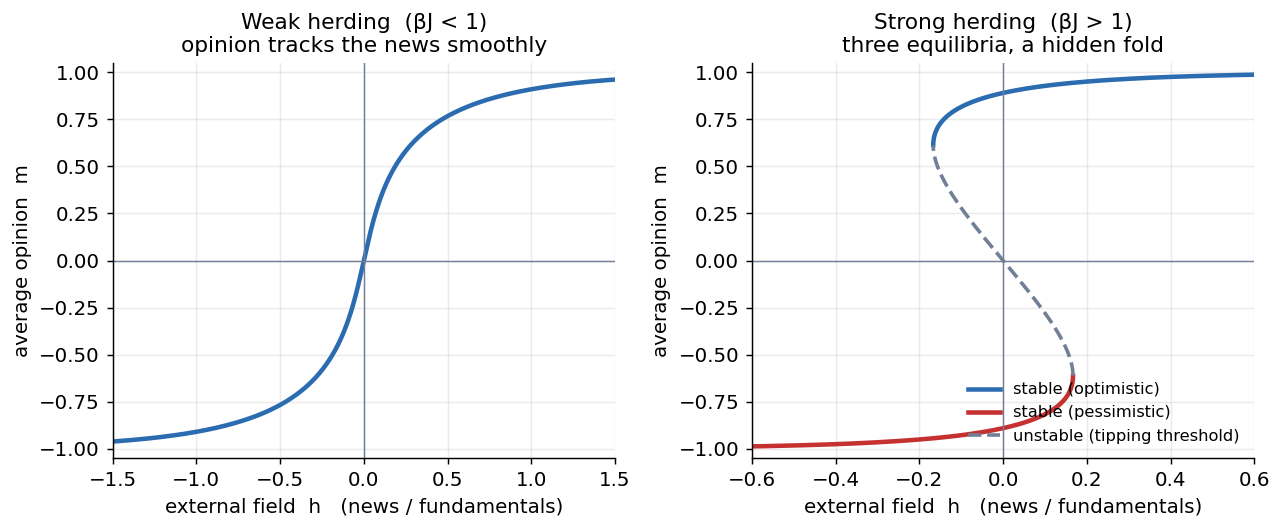
With weak herding (left) there is exactly one mood for each level of news. With strong herding (right) the curve folds over. For the same news the market can sit on the optimistic top branch or the pessimistic bottom branch. The dashed middle is a knife-edge it can never rest on.
On the left, weak herding, life is simple. Better news, slightly more bullish. Worse news, slightly more bearish. One mood per headline. This is the orderly world standard finance assumes, and in this regime that world is correct.
On the right, strong herding, the curve folds back on itself. Over a whole range of news, there are two stable moods the market could be in, optimistic or pessimistic, with an unstable mood in between that it tips away from. The remarkable part is that none of the news has to be dramatic to create this. The herding did it. Once a crowd copies strongly enough, holding two possible moods is baked into the structure of the crowd, not into the information.
#VI. Why regimes jump instead of slide
That fold has a famous side effect. Where the market sits depends on today’s news and on the path it took to get there. Physicists call this hysteresis: where you end up depends on the path you took, not just on today’s news. You already know it from a light switch: it clicks on and off at slightly different pressures, so it tends to stay where it is until you push hard enough.
Before you look at the next picture, make a guess. The market starts in its pessimistic mood and the news slowly, steadily improves. What does the mood do?
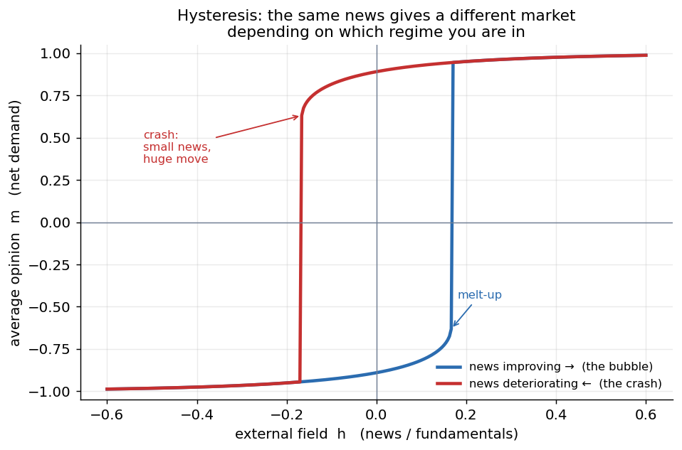
The same small piece of news leaves you in a different market depending on which branch you are riding, and the switch between branches is a jump, not a slide. The crash here is set off by a change in news no bigger than dozens before it that did nothing.
Start pessimistic and let the news slowly improve. The market grinds up the lower branch, reluctant, and it keeps grinding even past the point where a brighter mood becomes possible, because it is sitting in a stable state and small steps cannot dislodge it. Then the lower branch simply ends. There is nowhere left to stand, and the market jumps up to the optimistic branch. A boom.
Now run it backward. From the optimistic mood, let the news drift down. The market eases along the top branch, comfortable, until that branch runs out and it drops, all at once, to the pessimistic branch. A crash.
This is worth naming, because the idea runs through the rest of the series. Each stable branch is an attractor: leave the mood near it and copying pulls it back, the way a ball rolls back to the bottom of a valley. The dashed middle branch is the opposite, a repeller, and it marks the border between two basins, the moods that fall toward optimism and the moods that fall toward pessimism. While copying stays strong the crowd has two attractors at once. A boom or a crash is the moment one of them vanishes: the branch you are riding runs out, its valley flattens away, and the crowd has nowhere to sit but the other attractor. The simulation above draws this landscape live, under the grid: the valleys are the attractors and the dot is the current mood. Drag copying up and watch one valley split into two; tilt the news and watch the dot tip from one into the other.
This is what the 1987 detectives were missing. The crash did not need a cause its own size. The market had been walking a branch that was quietly about to end, and the last small step had nothing beneath it. The cause was the shape of the ground, not the size of the trigger. The model itself is symmetric, so it can produce jumps in both directions; real markets add leverage, liquidity stress, and forced selling, which is why the downward jump is usually the one people remember.
#VII. Why prices move more than the news
The most important setting is the tipping point itself, the same critical point from the magnet board. Guess first: as the market walks toward the edge, what happens to the size of its response to one fixed piece of news?
As the market approaches the critical point, its sensitivity to news runs off toward infinity. A vanishingly small headline moves the whole mood by a lot.
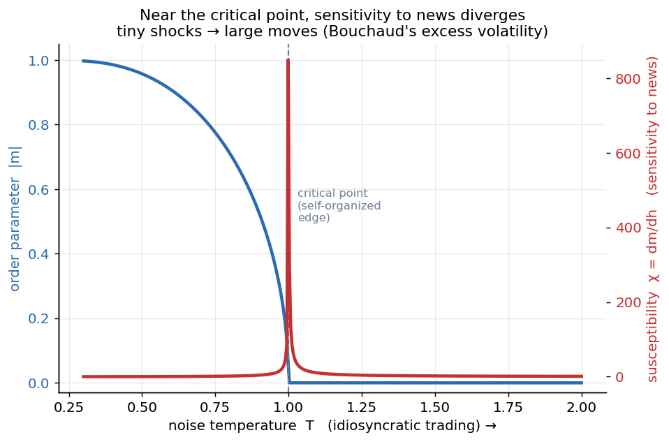
A shared mood appears once independent trading drops below the critical level, and the market’s sensitivity to news spikes right at the edge. Tiny shocks turn into big moves exactly where the crowd is balanced between its two moods.
Economists since Robert Shiller have had a name for this: excess volatility. Prices move far more than any honest measure of fundamentals can justify, and for decades that has been treated as a puzzle. In this picture the puzzle has a candidate answer: a market sitting near its tipping point would overreact, because near the edge the size of the move compared to the size of the news blows up.
So why would a market park itself at this twitchy edge instead of somewhere calm and safe? This is the idea of self-organized criticality, which the next post in this series takes apart on its own. The proposed story is that nothing tunes the market to the edge from outside, it drifts there on its own: competition wears down the independent judgment that keeps traders apart, and the hunt for an edge makes everyone watch everyone else, which turns the copying up and the independence down. That is a plausible mechanism rather than a measured law, so treat it as the hypothesis it is. What has been measured is the symptom. Treating trades as a chain reaction where each trade can set off others, Bouchaud’s group found that the share of trading driven by other trades, rather than by outside information, sits close to the level where the chain reaction would run away, and stays there across samples from 1998 to 2011. As a matter of measurement, markets often operate near that edge.
#VIII. Fat tails, made from the inside
Run the model as a real crowd of traders instead of a single average, keep it near the edge, and feed it nothing but small, slow nudges. The result looks a lot like a real market.
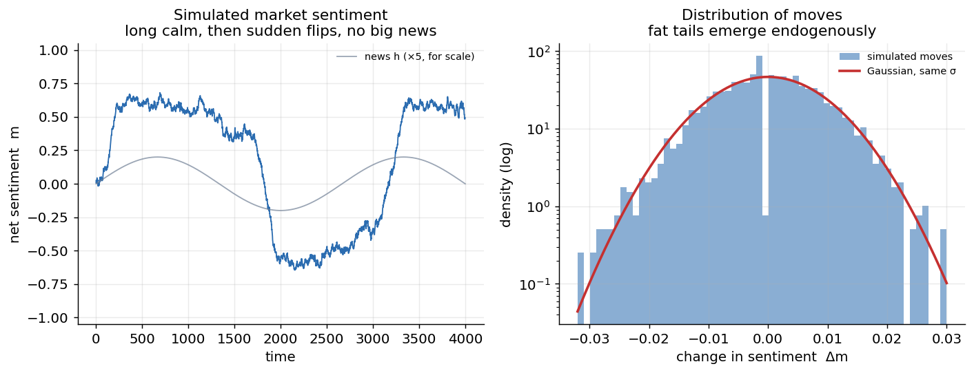
A simulated crowd of traders copying each other near the edge (left), and the spread of its daily moves (right). The big swings come from inside, with no big news to blame, and the extreme moves are far more common than a bell curve would ever allow.
This is the part I care about most. Fat tails fall out of the model on their own. A crowd of ordinary people copying their neighbors, with nothing fat-tailed going in anywhere, manufactures fat tails from the inside. The leptokurtic, heavy shape of real market returns is simply what a near-critical crowd looks like from the outside.
Those tails matter. Fit a bell curve to the S&P 500’s ordinary day-to-day movement, of about one percent, and then ask it about the real crashes.
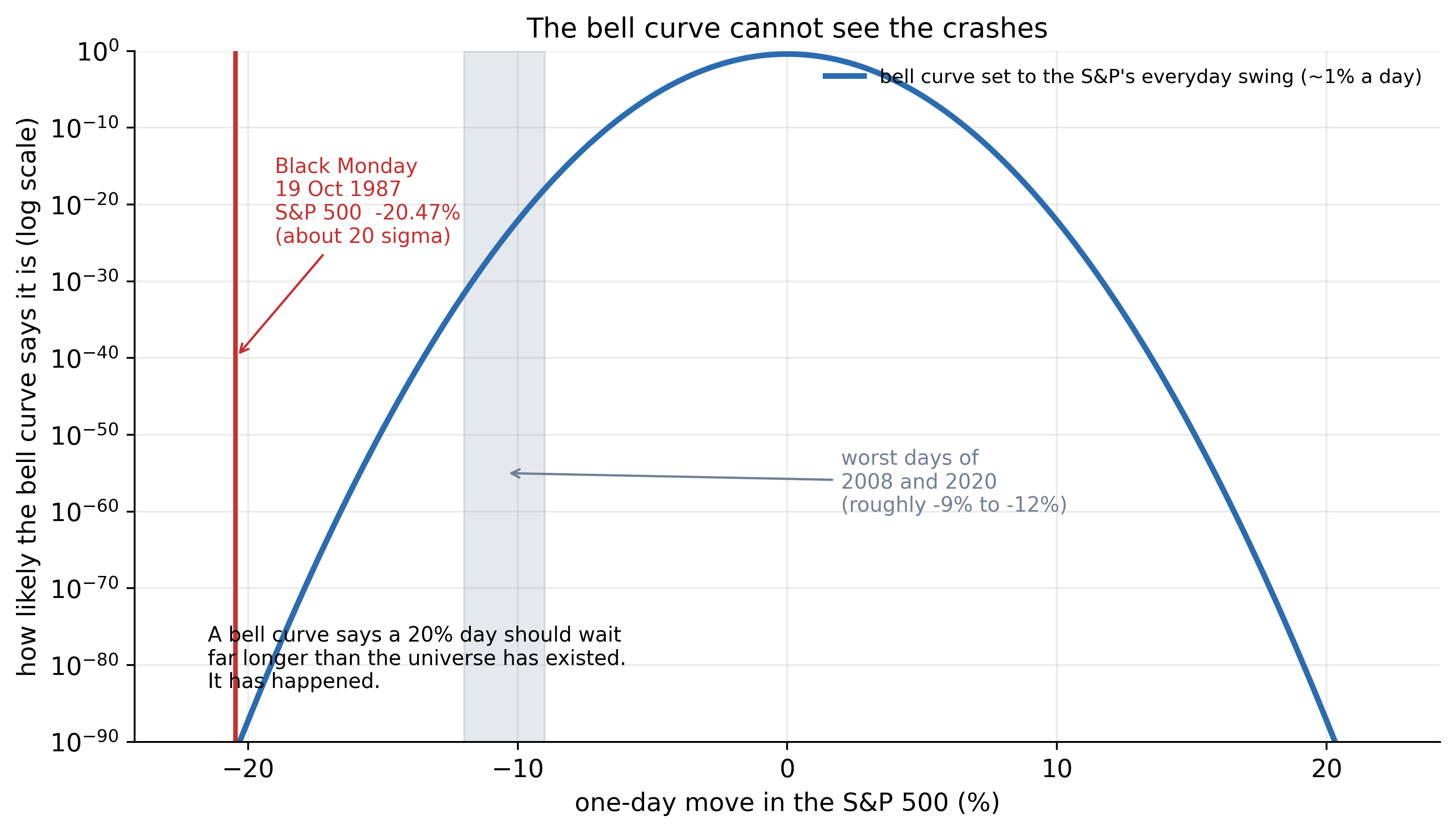
Black Monday was a move of about twenty standard deviations. A bell curve says a day that bad should wait far longer than the universe has existed. It happened anyway, and the worst days of 2008 and 2020 sit almost as far out. The model that calls these impossible is the one mainstream finance still runs on.
#IX. Why the calm is the dangerous part
There is one more twist, and it is the most useful one for anyone with money on the line. A system heading toward a tipping point gives off warning signs, but they look different from what you would guess. The danger rarely announces itself as drama and rising volatility. It often hides inside the calm.
Far from the edge, poke the system and it springs back fast, because the crowd’s pull holds everyone in place. Close to the edge, that pull weakens, so it drifts back slowly and wanders further. Two things give it away. Recovery slows, so each moment looks more like the one before it, which statisticians measure as rising autocorrelation. And the swings get wider, which shows up as rising variance. Both climb as the system walks toward its edge.
Slower recovery and wider swings, arriving together, are the fingerprint of a system approaching a transition, and the name for it is critical slowing down. The strange and useful part is that it lives in the quiet, not the storm, which is why a market where everyone agrees and nothing much seems to move can be the most dangerous one of all. A later essay in this series is devoted to this signature, where it comes from, and how far to trust it, so here I will only plant the flag and move on.
#X. What this is worth, and what it is not
A model of magnets gives orientation rather than orders. Here is what it actually gives you.
It takes the embarrassment out of the missing news. You stop hunting for a hidden cause behind every large move, because some large moves genuinely come from inside the crowd, and forcing a story onto them just dresses up noise.
It moves your attention from the shock to the setting. The useful question shifts from “how big is the news?” to “how close is the market to a tipping point?” A few signs say the crowd is near the edge: correlations rising, opinions bunching together, fewer genuine skeptics left, liquidity thinning. Those tell you more about danger than the headlines do. When everyone is watching everyone else, the market is primed to lurch, and the trigger barely matters.
Booms and crashes end up under one roof too. They are the same fold crossed in opposite directions, which is why one builds slowly and the other happens fast.
The model also carries a built-in humility, and the rest of this series leans on it. To use the model you would have to measure how close the market is to its tipping point, and that number is exactly the kind of unstable, tail-sensitive quantity that Nassim Taleb has spent a career warning against trusting. Knowing that crashes are phase transitions does not hand you the date of the next one. It tells you what kind of ground you are standing on, and that it can give way without a push. That alone is reason enough to carry insurance you do not think you need, and to treat a market where everyone agrees as far more fragile than one where people are still arguing.
#Further reading
On big moves arriving without news:
- Cutler, D. M., Poterba, J. M., and Summers, L. H. (1989). What Moves Stock Prices?. Journal of Portfolio Management, 15(3).
- Joulin, A., Lefèvre, A., Grunberg, D., and Bouchaud, J.-P. (2008). Stock Price Jumps: News and Volume Play a Minor Role. arXiv:0803.1769.
- Schwert, G. W. (1990). Stock Volatility and the Crash of ’87. Review of Financial Studies, 3(1).
- Federal Reserve History. Stock Market Crash of 1987.
On excess volatility:
- Shiller, R. J. (1981). Do Stock Prices Move Too Much to be Justified by Subsequent Changes in Dividends?. American Economic Review, 71(3).
On fat tails and the stylized facts of returns:
- Mandelbrot, B. B. (1963). The Variation of Certain Speculative Prices. Journal of Business, 36(4). The origin of fat tails in finance.
- Cont, R. (2001). Empirical Properties of Asset Returns: Stylized Facts and Statistical Issues. Quantitative Finance, 1(2).
On the Ising and discrete-choice models of herding:
- Brock, W. A., and Durlauf, S. N. (2001). Discrete Choice with Social Interactions. Review of Economic Studies, 68(2).
- Kirman, A. (1993). Ants, Rationality, and Recruitment. Quarterly Journal of Economics, 108(1).
- Lux, T., and Marchesi, M. (1999). Scaling and Criticality in a Stochastic Multi-Agent Model of a Financial Market. Nature, 397.
- Cont, R., and Bouchaud, J.-P. (2000). Herd Behavior and Aggregate Fluctuations in Financial Markets. Macroeconomic Dynamics, 4(2).
On crashes, criticality, and reflexivity:
- Johansen, A., Ledoit, O., and Sornette, D. (2000). Crashes as Critical Points. International Journal of Theoretical and Applied Finance, 3(2).
- Hardiman, S. J., Bercot, N., and Bouchaud, J.-P. (2013). Critical Reflexivity in Financial Markets: a Hawkes Process Analysis. European Physical Journal B, 86.
- Bouchaud, J.-P. (2024). The Self-Organized Criticality Paradigm in Economics and Finance. arXiv:2407.10284.
On multiple equilibria, attractors, and routes to chaos:
- Brock, W. A., and Hommes, C. H. (1998). Heterogeneous Beliefs and Routes to Chaos in a Simple Asset Pricing Model. Journal of Economic Dynamics and Control, 22(8-9).
- Gualdi, S., Tarzia, M., Zamponi, F., and Bouchaud, J.-P. (2015). Tipping Points in Macroeconomic Agent-Based Models. Journal of Economic Dynamics and Control, 50.
On phase transitions and universality, for the curious:
- Sethna, J. P. (2006). Statistical Mechanics: Entropy, Order Parameters, and Complexity. Oxford University Press (freely available online).
On complexity economics, broadly:
- Arthur, W. B. (2021). Foundations of Complexity Economics. Nature Reviews Physics, 3(2).
- Farmer, J. D. (2024). Making Sense of Chaos: A Better Economics for a Better World. Yale University Press. The book-length statement of this whole worldview.
Written with an LLM in the loop, like everything here. The ideas and the mistakes are mine. More on how I write.